Design Show and Tell – The Creative Laser Identity
For most of my professional life, I have worked in a design studio environment with other designers and creatives.
The shape of my days changed when I had a baby. I now have 3 really lovely kids and when I am asked what I do these days, I say I’m a stay at home mum AND a designer. While taking care of my family takes up a massive amount of energy and space in my day, I haven’t been able to resolve that, that is all I do. My priority is to give my children the tools and security they need to make a life for themselves and be happy. Part of that is making sure I maintain my interests in life outside of cheerleading for my kids.
I work from home as a freelance designer and am also working at getting The Creative Laser started as a viable business. A lot of my work is confidential with long document and report designs. Other work demands limitations that curtail your creativity. So when I got an opportunity to create an identity for myself, my creative juices started flowing.

The Creative Laser logo in all its 4mm laser cut acrylic glory
Any designer can tell you that we are our own most difficult clients. I have never met a good designer who didn’t have that perfectionist streak in them. Who didn’t sometimes work a logo into 20 variations sometimes just tweaking where the full stop sat or the curve of a top of a letter. I can say that with experience, I trust my intuition a little more and my design ‘taste’ helps me make decisions quickly if I force myself to.
I knew I wanted a typographic logo featuring a script font. I didn’t really want to muck around with too much of a colour palette. I was in effect, designing for laser output. The laser machine is great at detailed work, complex cuts and etching. Not so much with colour. And to go proper old school – the logo needed to work in black. As with any logo I design – I do the black and white test. A throwback to when fax machines was the ‘fast’ way to send a document to another business. So while I do occasionally get sucked into the prettiness of gradients and colours of logos – I still love the logos that can still look great just in black.

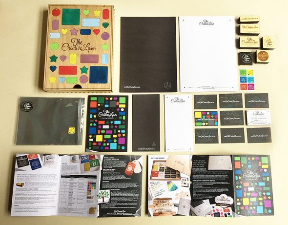
Business cards with 8 alternating designs for the back.
I then needed to build a graphic library of design elements I could use across The Creative Laser identity. I decided to showcase a lot of linework, geometry and outlines of the products we specialise in. And then I took inspiration from the materials we were sourcing to work with on the laser. Materials like dual tone outdoor plastics, acrylics, and anodised aluminium tags.
I found a company called moo.com which printed these gorgeous business cards and when I laid eyes on their luxe cards and got the samples, I knew I had to get me some of those cards. The colour sandwiched in the middle of these 600gsm cards finalised the decision for me.
I have a real thing for paper. And fine craftsman printing. I will unashamedly lift a printed item or paper to sniff and caress. That scene in the film, America Psycho where the men have a big dick moment with the laying out of their business cards describing the paper, the print and finish. That’s actually one of my favourite scenes of all time. And yeah I did get a little moist with the showdown. I totally GOT IT.
Moo.com have a pretty serious operation I must say. They got it all automated and the quality control is crazy good. The blacks were super rich and delivery was on time. Shipping was a killer – but for the product and comparable quotes with local printers – I actually turned out cheaper. And no one in Australia I found was offering the 600gsm with a colour line running through it.
The bonus was that this company was able to do different backs for my business cards so then I really went to town coming up with alternate backs. These patterns, lines and design elements would become the building blocks for creating the rest of The Creative Laser’s visual identity.

printed via moo.com on 600gsm Mohawke Superfine with a colour sandwiched in. hawt. seriously hawt.
Answering to no one except myself, I actually rediscovered some of the fun in design. Especially when you stop yourself from 20 rounds of variations.